White Space
Visual Hierarchy
Contrast
Design
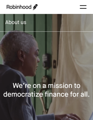
The first website included on this page is by the company Robinhood Markets, Inc.(Robinhood). Specifically, I am refering to the excellent use of white space on their "about us". They did an excellent job of not overloading the user with too much information when they firs land on the page, which can be crucial for user understanding
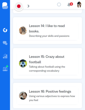
The second website I found is a perfect example of effective visual hierarchy. The website/businesses name is Busuu Online S.L. (Busuu). When using the main learning site, it becomes very apparent what links, images, and tabs have priority.
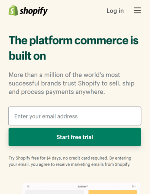
The last website I wanted to mention was Shopify Inc. (Shopify) for their use of contrast. It is not the starkest example of contrast among websites, but it is both easy to view and not distracting in any way. There is a lot to be said about efficiently using contrast and not sidetracking a potential user.
If you want your websites to be both appealing and easy to navigate, than I would strongly recommend visiting other websites and viewing their design from a critical perspective. Check their source code, if you can, and enjoy the process of building a website.